Glitzer war schon immer ein absoluter Hingucker in der Welt der individuellen Bekleidung. Er fängt das Licht ein, verleiht Textur und macht aus einem schlichten Design ein hochwertiges, auffälliges Statement-Piece. Jahrelang bedeutete dieser Glanz, sich mit unsauber geschnittenem Vinyl oder Siebdruck mit Glitzerfarben herumzuschlagen. Doch jetzt gibt es Glitter DTF – eine einfachere und vielseitigere Methode, Ihren Kleidungsstücken einen Hauch von Glamour zu verleihen.
Dieses aufregende neue Medium ist jedoch kein einfacher Ersatz für herkömmliche DTF-Drucke . Der Glitzereffekt verändert grundlegend, wie Ihr Design vom Bildschirm auf das T-Shirt übertragen wird. Wenn Sie ein normales Design ohne Anpassungen als Glitzer-DTF-Transfer drucken lassen , könnten Sie mit dem Ergebnis unzufrieden sein.
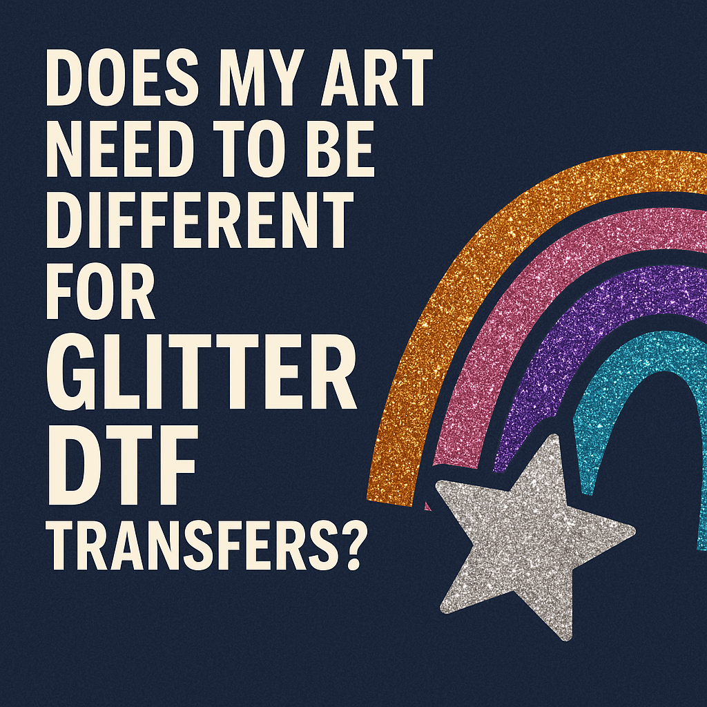
Dieser Leitfaden erläutert Ihnen die wichtigsten Unterschiede zwischen Standard- und Glitter-DTF und zeigt Ihnen, wie Sie Ihre Grafiken anpassen müssen, um bestmögliche Ergebnisse zu erzielen.
Worin unterscheidet sich Glitter DTF von Standard DTF?
Um zu verstehen, wie man dafür ein Design entwickelt, muss man zunächst die Technologie verstehen.
Bei einem Standard -DTF-Transfer wird Ihr Design auf eine transparente Folie gedruckt. Die Farben Ihrer Grafik entsprechen exakt dem Endergebnis.
Beim Glitter-DTF- Verfahren ist der Prozess etwas anders. Anstelle einer transparenten Folie wird das Transfermotiv auf eine Folie gedruckt, die bereits mit feinen Glitzerpartikeln versehen ist. Beim Drucken verbindet sich die Tinte mit dieser glitzernden Oberfläche. Der Glitzer wird nicht in die Tinte eingemischt; vielmehr liegt die Tinte auf der Glitzerschicht und lässt den Glitzer durchscheinen. Die mit Tinte bedruckten Bereiche Ihres Designs erhalten ein glitzerndes, farbiges Finish, während alle „leeren“ oder transparenten Bereiche unbedruckt bleiben.
Diese Unterscheidung ist entscheidend. Der Glitzer ist die Leinwand, nicht nur ein aufgesetzter Effekt. Das beeinflusst Farbe, Details und die Gesamtwirkung des Designs.
Wichtige Anpassungen am Artwork für Killer Glitter DTF
Beim Designen für Glitzer geht es nicht darum, bei Null anzufangen. Es geht darum, kluge und strategische Anpassungen an Ihren bestehenden Grafikdateien vorzunehmen.
Setzen Sie auf Mut: Dicker ist besser
Die wichtigste Regel für Glitter DTF ist, ultrafeine Linien und winzige, filigrane Schrift zu vermeiden.
- Warum? Die Textur der Glitzerfolie kann es erschweren, dass sehr dünne Linien richtig haften und ein gleichmäßiges Aussehen erhalten. Eine Linie, die auf einem herkömmlichen DTF-Druck scharf erscheint, kann auf einem Glitzertransfer unterbrochen oder verblasst wirken. Der Glitzer selbst erzeugt visuelles „Rauschen“, das feinste Details überdecken und verdecken kann.
- Was zu tun:
-
- Kontur hinzufügen: Wenn Ihr Design dünne Linien enthält, fügen Sie in Ihrer Designsoftware (wie Adobe Illustrator oder Affinity Designer) eine kleine Kontur hinzu, um sie zu verstärken.
- Wählen Sie fette Schriftarten: Verwenden Sie für alle Textelemente dickere, ausdrucksstärkere Schriftarten anstelle von zarten, schreibschriftartigen Schriftarten. Serifenlose Schriftarten eignen sich oft besser als filigrane Serifenschriften.
- Komplexe Bereiche vereinfachen: Wenn Ihr Logo extrem detaillierte Abschnitte aufweist, sollten Sie eine vereinfachte Version speziell für Glitzeranwendungen erstellen.
Verstärke den Kontrast
Die Farbwirkung ist bei Glitter DTF völlig anders. Der darunterliegende Glitzer dämpft die darüber gedruckten Farben leicht ab.
- Warum? Ein herkömmlicher DTF-Druck hat eine weiße Grundierung, wodurch die Farben leuchtend und deckend wirken. Beim Glitter-DTF-Druck wird das Licht ständig von den Glitzerpartikeln unter der Tinte gebrochen, was die Farben leicht entsättigen kann.
- Was zu tun:
-
- Sättigung erhöhen: Erhöhen Sie beim Vorbereiten Ihrer Datei die Sättigung und den Kontrast der Farben leicht. Ein Design, das auf dem Bildschirm etwas zu grell wirkt, sieht auf der Glitzerfolie wahrscheinlich perfekt aus.
- Setzen Sie auf kontrastreiche Farben: Designs, die auf dezente, kontrastarme Farbpaletten (wie Hellgrau auf Mittelgrau) setzen, verlieren an Kontur. Wählen Sie stattdessen kräftige, kontrastreiche Kombinationen wie Schwarz und Gelb, Rosa und Weiß oder Dunkelblau und Silber.
- Dunkle Farben leuchten: Dunkle Farben wie Schwarz, Marineblau und Tiefviolett sehen auf Glitter DTF fantastisch aus. Die Tinte bildet eine dunkle Basis, die den Glitzer besonders gut zur Geltung bringt. Scheuen Sie sich nicht, große schwarze Flächen zu verwenden!
Lass den Glitzer die Arbeit machen: Nutze den Negativraum
Das Coolste an Glitter DTF ist, dass man den Glitzer selbst als Gestaltungselement verwenden kann.
- Warum? In Ihrer Designdatei werden alle transparenten Bereiche nicht bedruckt. Dadurch scheint der natürliche, silbrige Glitzer der Transferfolie durch. So können Sie einen „Silberglitzer“-Effekt erzeugen, ohne spezielle Silberfarbe zu benötigen.
- Was zu tun:
-
- Erstellen Sie Aussparungen: Anstatt mit Silber zu gestalten, können Sie Teile Ihres Designs aussparen, um die Glitzerbasis freizulegen. Dies eignet sich perfekt, um funkelnden Text oder Highlights innerhalb einer größeren farbigen Fläche zu erzeugen.
- Designs im Used-Look: Used-Look-Texturen sehen mit Glitter DTF fantastisch aus. Die kleinen, transparenten Lücken in der Textur werden mit purem Glitzer gefüllt, was dem Design Tiefe und einen luxuriösen Vintage-Charme verleiht.
- Konturen: Eine einfache, kräftige Kontur, bei der die Mitte ausgeschnitten ist, ist eine klassische Methode, um mit minimalem Tinteneinsatz ein atemberaubendes Glitzerdesign zu kreieren.
Die richtigen Farben verstehen: Was passt am besten?
Man kann zwar jede beliebige Farbe drucken, aber manche Farben erzielen auf Glitzergrund bessere Ergebnisse als andere.
- Einfarbige Farben sind Trumpf: Schlichte, flächige Farben erzielen die besten Ergebnisse. Komplexe Farbverläufe oder fotorealistische Bilder können in Kombination mit Glitzertexturen trüb wirken oder an Details verlieren.
- Vermeiden Sie helle Pastelltöne (auf großen Flächen): Sehr helle Farben wie Babyblau oder Hellgelb können blass wirken, da der Glitzer die feinen Farbpigmente überdecken kann. Wenn Sie diese Farben verwenden, achten Sie darauf, dass sie von einer dunklen, kontrastierenden Farbe umrandet werden.
- Weiße Tinte als Akzent: Ein Design mit rein weißer Tinte auf einem Glitter-DTF-Transfer erzeugt einen wunderschönen, schimmernden Silbereffekt, der sich von der Verwendung von Negativraum unterscheidet.
Soll ich Glitter DTF oder normales DTF verwenden?
Während du dein Kunstwerk anpasst, überlege, ob Glitzer die richtige Wahl für das Projekt ist.
- Wählen Sie Glitter DTF, wenn:
-
- Das Design eignet sich für Fanartikel, Cheerleader-Teams, Junggesellinnenabschiede oder Festtagskleidung.
- Sie wünschen sich einen hochwertigen, edlen Look.
- Das Design ist auffällig, grafisch oder textbasiert.
- Sie möchten die Sauerei herkömmlicher Glitzermethoden vermeiden.
- Wählen Sie Standard-DTF, wenn:
-
- Das Design ist ein Foto oder weist komplexe Farbverläufe auf.
- Das Kunstwerk enthält extrem feine Linien oder winzige Schrift.
- Für ein erfolgreiches Corporate Branding ist eine präzise Farbabstimmung unerlässlich.
- Das Budget ist knapper (Standarddrucke sind kostengünstiger).
Vergessen Sie nicht, dass Ihnen auch andere Möglichkeiten zur Verfügung stehen. Für Funktionsbekleidung aus Polyester ist ein individueller Sublimationsdruck möglicherweise die bessere Wahl für ein weiches Tragegefühl, während einfache, einfarbige Logos für Hartwaren oft am besten mit Oracal-Vinyl umgesetzt werden .
Ja, Ihre Designs müssen für Glitter-DTF-Transfers unbedingt anders gestaltet sein. Durch kräftigere Linien, höhere Kontraste und den geschickten Einsatz von Negativraum können Sie über das bloße Hinzufügen von Glitzer hinausgehen und mit Glitzer gestalten . Es ist eine subtile, aber wirkungsvolle Veränderung Ihrer Denkweise, die Ihre Produkte von anderen abheben wird.
Der Schlüssel liegt darin, den Glitzer als aktiven Bestandteil Ihres Designs zu betrachten, nicht nur als Finish. Sobald Sie die Gestaltung mit Glitzer beherrschen, können Sie Ihre Transfers mit einer professionellen Maschine wie der MEM-Heißpresse aufbringen und atemberaubende Kleidungsstücke kreieren, die alle Blicke auf sich ziehen.
Bereit, Ihrer Produktlinie etwas Glanz zu verleihen? Entdecken Sie unsere individuellen Glitzer-DTF-Transfers und lassen Sie uns Ihnen helfen, Ihre kühnsten Ideen zum Leben zu erwecken!